Terminology
There’s a debate about precise definitions in this field since it’s relatively new (20-30 years). Here’s my attempt to define some terms in the context of the software world:
- User Interface (UI) - A user interface (UI, e.g. a command line) or a graphical user interface (GUI) where the user interacts with the software.
- User Interaction - Includes UI and concerns about HOW users interact with our software and WHY they interact with it in these particular ways. Designing User Interaction is often based on user research and NOT personal beliefs and preferences. Human-computer interaction (HCI) is one of the most studied topics and includes fields such as graphic, speech, and touch interactions.
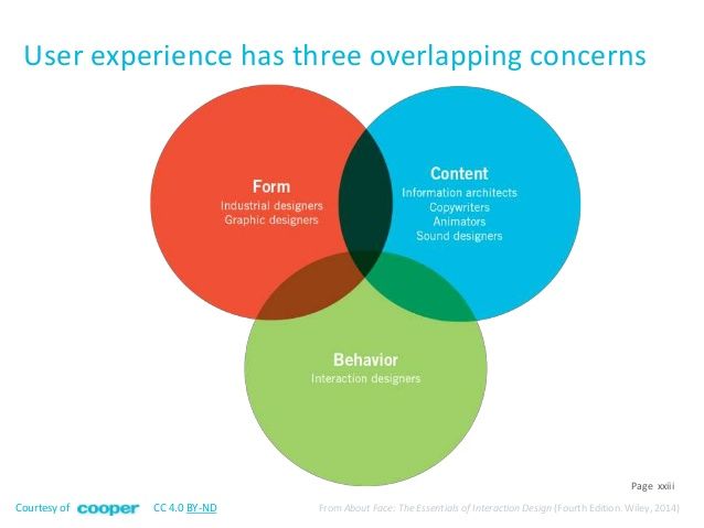
- User Experience (UX) - Includes User Interaction and has a broader scope to understand HOW users experience our software from three core views: behavior, form, and content. In the context of games, our research is usually in the form of play-testing sessions.
 User Interaction is part of User Experience
I will mainly talk about User Interaction (visual interaction), and based on my findings, I will design my first sketch for a User Interface. I have no previous experience designing user interfaces, and I appreciate any feedback.
When it comes to User Experience (UX), it’s all over the place in games: animations, sound design, content, and User Interface (UI/GUI). In the graph above, while we can see fields such as sound design as part of the User Experience (UX), it has nothing to do with User Interface (UI) and User Interaction (Behavior bubble). Why? Since it won’t impact the behavior of the users with our interface (unless we put some harsh noise and users will avoid clicking buttons). However, we can add sound effects as additional assets to the user interface (Content bubble) to increase immersion.
Let’s focus on the User Interaction definition. Answering the WHY question is not easy. It requires research and qualitative tools such as interviews to crack the logic of WHY users behave in specific ways with our software. Without this feedback, we often attempt to solve problems based on our beliefs and preferences instead of evidence. After gathering evidence, we build our hypothesis, test it, and reiterate it repeatedly. Since there is no final state in UX - we keep learning and improving.
User Interface emerged from Classical Graphic Design and used to be associated with a final product to deliver. However, since websites and apps constantly change today, the design is never final. With games, it’s tricky since we deliver a final product. So there must be an end state. Games are a slightly different medium; they’re somewhere between those two approaches:
- Traditional Classical Design with final delivery (print, architecture).
- User Interaction with an iterative mindset (websites, apps).
That’s why games have the room for artistic finishes to help design the mood of the entire experience and contribute to the overall immersion.
Still confused? try this youtube video by NNg.
Low-fidelity Prototype
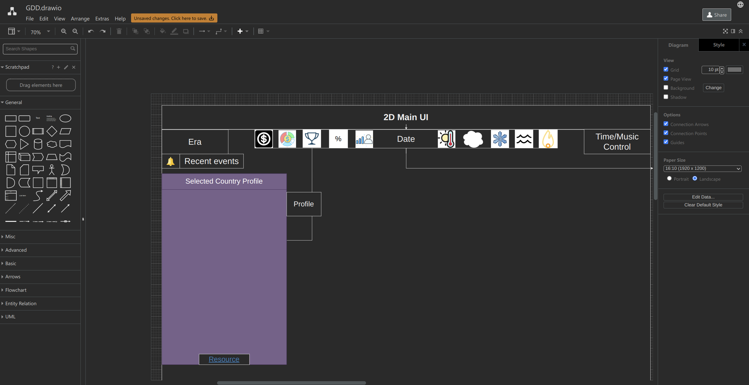
Choosing the Layout
Before searching for any inspiration, I made a basic layout in draw.io to understand what I needed in the UI. This specification of elements will help me create the design around the user’s needs. This approach also known as user-centered design. Jamal Nichols says in his courses (linked below): “The best designers stay in the lowest possible fidelity, for as long as possible”. I like this statement - it can easily be translated to Game Design and gives me the freedom to make rapid changes in no time.
 The best designers stay in the lowest possible fidelity, for as long as possible.
Inspiration
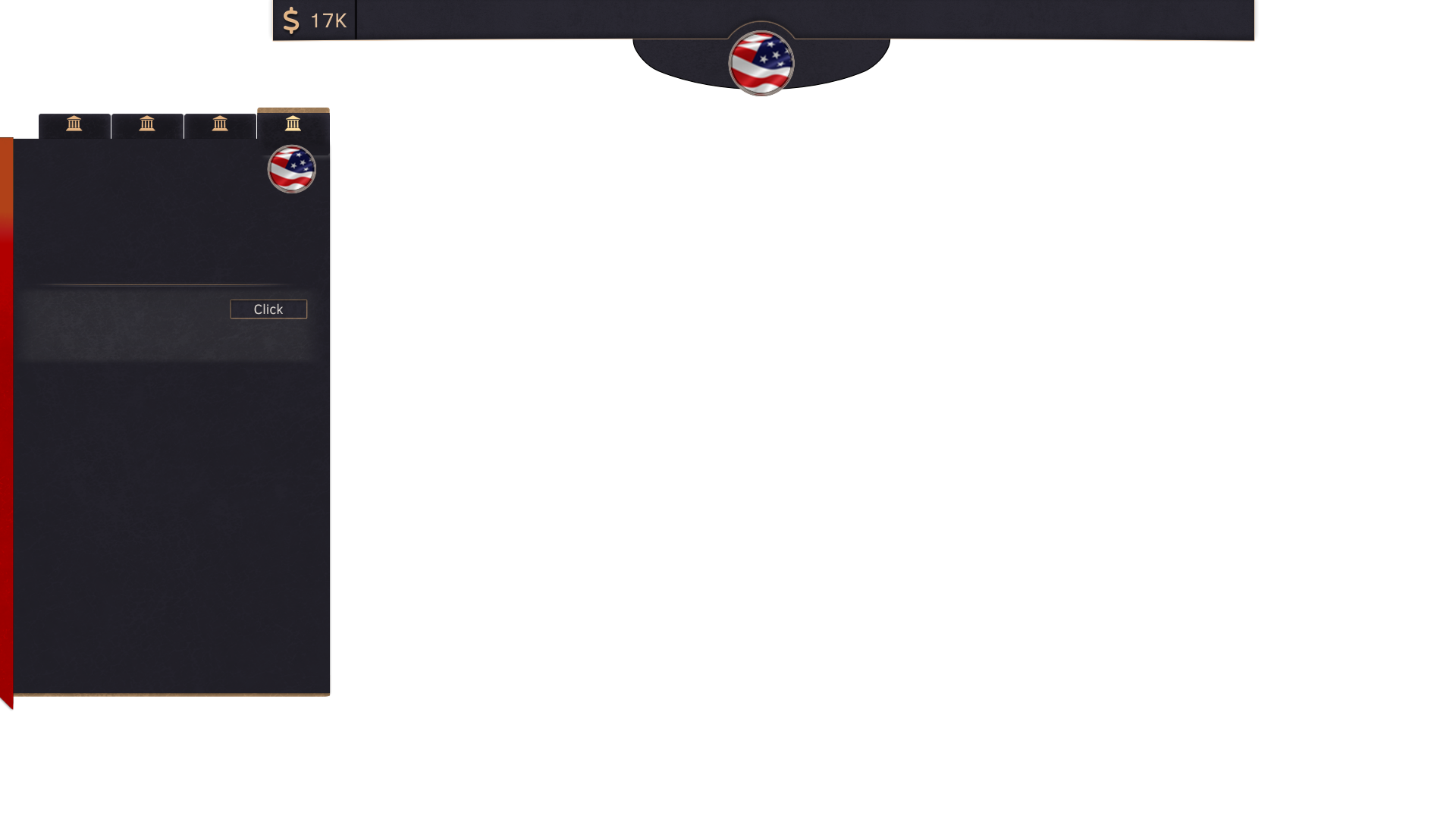
After a simple specification in mind, I explored some designs in Game UI Database. Crusader Kings 3 isn’t there at the time of writing, but I was inspired by its UI, combined with Anno 1800. Both UIs are clean and modern yet have an artistic vision and are not entirely flat.
 CK3 UI
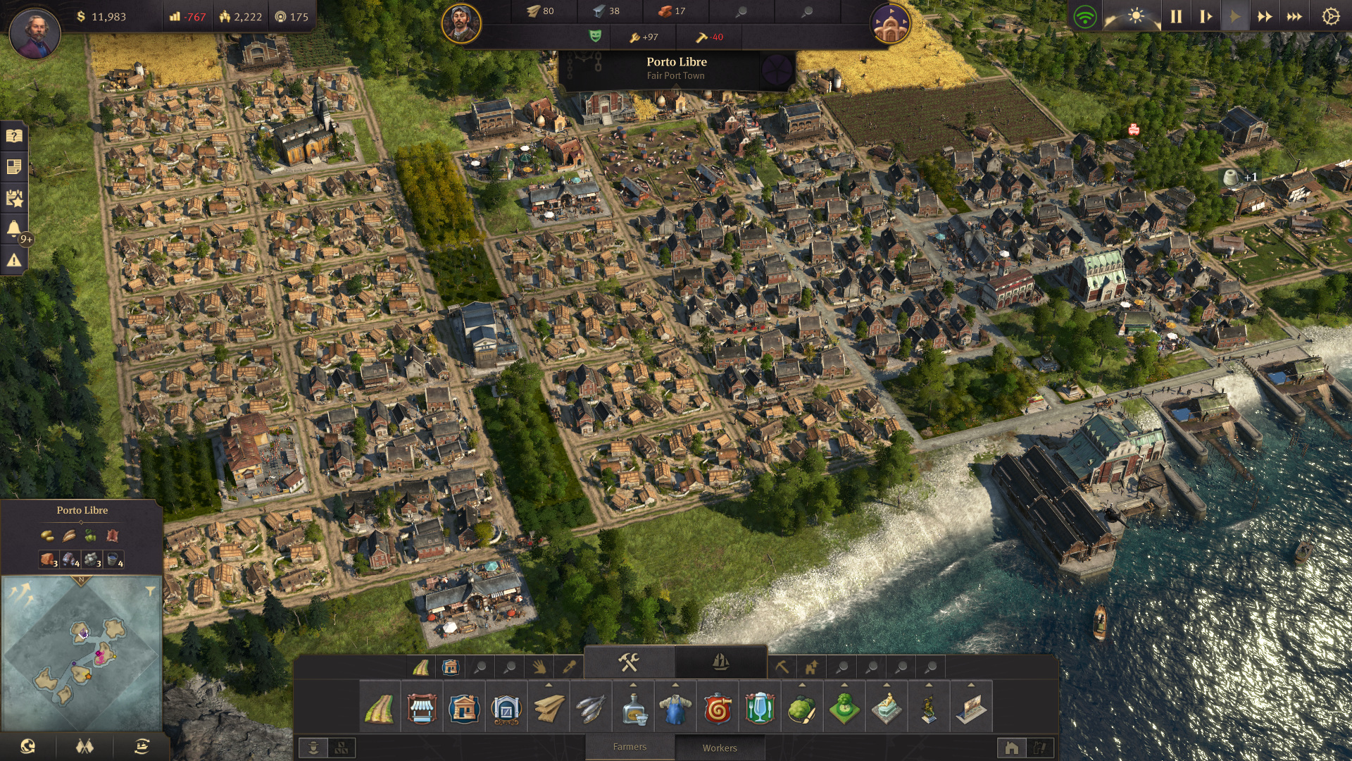 Anno 1800 UI
Choosing Base Colors
Since I like the base color of Godot’s UI, I chose it, changed it a bit, and expanded my palette using mycolor.space. Google’s material design helped me understand HOW to use colors in the UI; contrast, primary and secondary colors, and accessible colors.
Medium-fidelity Prototype
From draw.io to Krita
I couldn’t help it, and I wanted to jump into Krita and create a medium-fidelity prototype before the entire wireframe was ready. I also think it’s fine to do so; it’s a game with many UIs and elements. Also, It already took me several weeks of iterations in the Game Design Document (along with other game mechanics). At this point, I knew I wanted to make the UI as concise as possible - I didn’t want the user to look for different corners on the screen to forward the game’s clock. I want everything to be in front of him. Therefore, the top panel will have all the necessary information and controls, and the side panel will contain the game mechanics. There’s also a plan for bottom menus, but these are still in their low-fidelity stage.
Small Details
According to NNg, taking elements from the real world helps build experiences that feel intuitive (linked below). So here is the time to take elements from the real world and convert the wireframe into a medium-fidelity prototype. First, since the left panel will contain various options and details about specific countries, a leather book feels intuitive and classic to me. I’ve used textures from PolyHaven to create the feeling of a leather book. The top panel is more artistic, but it follows the repetition of the left panel, and it contains the same texture and colors. The game controls will be placed just below it in the flag’s section. I slightly bent the top menu to break its square shape and added some depth and fine lines.
 Medium-fidelity Prototype
High-fidelity Prototype
From Krita to Godot
I implemented a very basic version of it in the game and stopped after a while since I realized any change would take a while if the layout will change every now and then. I’m still in the low-fidelity prototype, and once I have the basic layout, I will implement it in the Godot.
And.. back to low-fidelity
Iteration is the key. I just created a simple layout to try and feel the game. Now the real low-fidelity work begins.
Resources: Game UI Database, NNg’s blog, Jamal Nichols’s courses